Tytus Brzozowski, un retrato surrealista de Varsovia en transformacion

El subconsciente puede convertirse en una poderosa herramienta creativa si el caldo de cultivo del que se alimenta reúne los ingredientes optimos, que en el momento adecuado y siempre y cuando se dén las condiciones precisas permitan representar a través de algunas de las muchas disciplinas artisticas.


Ese fragmento de realidad que el artista quiere legar a todos aquellos que en algún momento tengan la oportunidad de acercarse a alguna de sus propuestas. Pudiendo encontrar en alguno de sus matices la interpretación más próxima a la que como individuo observa en su entorno. Una versión en definitiva lo suficientemente documentada que contenga las suficientes rasgos a través de los que reforzar su identidad.

Elementos que ya sean en conjunto o por separado den como resultado una narrativa cuyo estilo e influencia sea lo suficiente nítida, como para que permita al espectador establecer una complicidad con aquellos elementos que conforman su cotidianidad. Que en síntesis y contexto refleje su posible representación en la obra que se despliegá ante sus ojos. Independientemente del formato en que se presente.


Elemento, el del medio que se utiliza para mostrar la obra que toma más relevancia de la que en principio pudiera parecer. Siendo una elección menos gratuita de lo que en un principio se valora, máxime si tenemos en cuenta que el artista suele invertir una parte considerable de su tiempo en la concepción y posterior materialización de la idea que de forma disciplinada y paciente, ha visto nacer primero como un embrión para posteriormente plasmarla generalmente en un esbozo.


Una idea general que finalmente plasmará a través de los medios expresivos que considere más oportunos a la hora de proyectar su trabajo alcanzando las audiencias más amplias posibles. En este contexto de volatilidad permanete. Cada vez son más numerosas iniciativas creativas que se han reinventado alcanzando las más altas cotas de popularidad, gracias a que tomaron la feliz decisión de ampliar los márgenes de digamos del continente material que utilizan para comunicar su obra.

Habiendo sido el espacio público con todos sus reparos y beneficios un acicate para que muchos artistas circunscritos a la más estricta de la ortodoxia, al menos en terminos expositivos. Lo que les ha permitido que su discurso artístico tanto en forma como en fondo se materialice en los ojos de una audiencia más o menos casual, que de otra forma le hubiera sido ajena a su propuesta.

La vertiente urbana de Tytus hace referencia a la ciudad y su transformación 


Efecto que en la mayoría de los casos supone una pequeña epifania, pués su obra pasa de ser retundamente desconocida a ser compartida por una cantidad de público cuyo aumento suele ser exponencial y equivalentes a aquellos elementos autotocnos. Que como ya he dicho y reitero están más involucrados en la vida doméstica de los que se asoman a su obra.

Si a version doméstica de estar por casa, el artista Le añade la habilidad de añadirle una determinada perspectiva histórica del lugar y la comunidad en la que vive o ha pasado su infancia. Además de mostrar en su estilo alguna referencia de alguno de los periodos artísticos de su pais tenemos una propuesta con la que es relativamente sencillo conectar.


Salvo matices tanto las obras de carácter formal como las que crea específicamente para el espacio público del artista polaco Tytus Brzozowski obedecen a este contraste. Por una lado establece un continuo diálogo con el paisaje local a través de la arquitectura fundamentalmente mientras se observa la influencia de artistas nativos y más o menos cercanos en el tiempo, como el pintor surrealista Rafal Olbinski.

Los paisajes urbanos del artista Tytus Brzozowski, recuperan para la memoria colectiva edificios y escenas domésticas desde una práctica surrealista.

De cuya obra ya dije en su momento el gran impacto que me causo, y que tuve la oportunidad de redescubrir cuando estuve visitando Varsovia en 2019. Sin embargo en las representaciones corales de Tytus destacan por la polifónia en el tratamiento del color que les da una patina que destaca por su optimismo, mientras que las obras de Rafal beben del barroco.

Obras donde los motivos se diluyen siendo el cuerpo central el objeto sobre el que se construye la narrativa a interpretar por parte del espectador. Mientras que los proyectos de Tytus ya sean los elaborados para lienzo a una escala menor o los grandes murales, que tienen como lugar de operaciones principalmente la capital Polaca, pecan en ocasiones de hipertrofia.

Debido a la gran cantidad de elementos que estan implicados en una trama y subtramas. Y está observación no quiero que se intérprete como algo negativo, Ya que muchos de estos símbolos cuya clave tras ser desvelada permite arrojar luz sobre el contexto de lo que trata el conjunto de lo que se expone. De unas obras cuya versión en exterior al no encontrarse con las limitaciones del lienzo se desatan en un sin fin de pequeñas historias gráficas que a su vez se retro-alimentan un discurso casi infinito.

Murales y cuadros donde la ciudad elevada se complementa con la presencia de la gente

Característica que se puede observar en una de sus últimas propuesetas, que tuvo como escenario (como otras muchas), el distrito de Voila de la capital polaca. Donde Tytus cuenta ya con una dilatada muestra. En este caso el artista selecciono una de los últimos muros laterales que cierra una de los pocos conjuntos de edificios construidos a principio del Siglo XX.

Cuando lo que hasta ese momento había sido una villa situada en las proximidades de la ciudad, había acabado finalmente absorbida por una ciudad en plena expansion. Y que en estos momentos, cuando se ha cumplido poco más de cien años de esta incorporacion. Este barrio situado al Oeste, ha experimentado una transformación en vertical.

Fenómeno muy común en estos tiempos, pasando de presentar un urbanismo digamos heredado de su época provincial. Ha presentarse como parte de lo que ya se conoce como el nuevo y flamante distrito financiero de la ciudad. Considerado como uno de los que más proyección posee en el Este de Europa.

En Wola's Collisseun se representa un distrito que está mudando su fisionomia

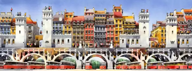
Por eso el que ya ha sido como el Warsaw's King, apelativo con el que ha sido bautizado Tytus a nivel popular, debido a la magnificencia y grandiolocuencia de sus intervenciones. En el caso de este mural titulado de forma muy acertada y coherente bajo el apelativo de Wola's Collisseum, nombre que tiene como origen unas ruinas de forma circular adyacentes. Conserva muchos de los parametros que se observan en buena parte de los trabajos realizados para exterior.

Tanto en lo estetico como en el empleo de los materiales para completar la obra. Comenzando por las dimensiones del proyecto una enorme secuencia XXL. Que desarrolla ante nuestros inquietos ojos todo una escena, que según las propias declaraciones del autor, pretende ser un homenaje a la vida cotidiana que hasta hace no mucho tiempo se podía percibir cuando uno recorría sus calles.


Su obra figurativa recurre a constantes elementos decorativos, con los que  logra establecer un vínculo con la memoria del lugar que retrata.


Escenas más o menos domésticas que Tytus representa desde una óptica sosegada y natural, y en todo caso muy alejada de una interpretacion nostalgica de un pasaje de la historia vivida por una comunidad, donde la vida familiar y doméstica se contempla como si fueran antecedentes muy distantes en el tiempo e incluso en el espacio, su tratamiento y distribucion.   

Pues la narrativa arquitectónica actual caracterizada por colosales edificios levantados a partir de estructuras de acero, que alcanzan por término medio las  cincuenta alturas. Estructuras envueltas por kilométricas vidrieras ahumadas que se alternan con las espejadas que proyectan el edificio dotándole de más protagonismo si cabe.


Efecto amplificado de un paisaje urbano contemporáneo y cosmopolita, que contrasta con el nutrido grupo de casas representados en el mural. Edificaciones que en la mayoría de los casos no superan las dos alturas. Aunque el fragmento alrededor del que gira está obra de tres cuerpos es sin duda el par de tanques de gas visibles desde la estación de Zachodnia


Erigidas durante la Revolución Industrial, estas dos rotondas fueron finalmente desmanteladas en 1978 y desde entonces se han convertido en un coto de caza favorito para los exploradores urbanos. Además de estos tanques de gas, el mural también representa graneros que fueron destruidos durante el asedio de Varsovia en septiembre de 1939, además de las innumerables fábricas históricas de Wola representadas por una chimenea de ladrillo.


El mural que se puede visitar en Wschowska 10, ha sido elaborado con una gama de pinturas en su totalidad con anti-smog y creadas a propósito para neutralizar los óxidos de nitrógeno y otros contaminantes. Un criterio relevante en la consecución de esta obra en términos medio-ambientales, pues es el autor estima que se ha conseguido evitar la tala de cientos de arboles.


RO & AD - Moses Bridge, a bridge that crosses at the water's edge


Upon completion of its construction, the architects of RO & AD did not hesitate to baptize it with the title of one of the most quoted biblical passages. But nothing could be further from the truth: the Moses Bridge.


It has little or nothing to do with the ephemeris represented in the sacred text, not even in an aesthetic sense. Its inspiration must be sought many centuries later, specifically during the seventeenth century. The Netherlands built a series of moats and fortifications in the region of West Brabant


In order to provide protection against the incursions of the French and Spanish forces. One of these forts was known as Fort de Roovere. It was surrounded by a small fosse that served as protection against attacks and floods produced when the tide rose.                              

From a distance, the Moses Bridge is invisible to the eye. The flow around the fosse seems continuous, as the water level is parallel to that of the moat that crosses it, reflecting its natural environment. As visitors approach the fortress, the bridge is visualized as a break that divides the watercourse, creating a unique visual phenomenon.


READ IT IN SPANISH: RO & AD - Moses Bridge, un puente que cruza a ras del agua


The tank that divides the watercourse is a structure anchored to the bed by steel piles. Lined with wooden slats for the walls, which are made of the same material as the pillars. The bridge and its components are made of sustainable wood. 


The wood is Accoya, a type of material that, when properly treated, makes the bridge waterproof and reliably resists the erosion produced by the current. Protecting it from fungi and increasing its durability. Being an ideal material for a bridge of these characteristics. 


It has recently been recognized by the Dutch College of Architects as the best structure of the year 2011. In addition, the sponsors are among the finalists for the Dutch Design Awards 2011.


Suppose Design Office, Japanese avant-garde architecture that looks to the past


Inspired by the first recorded house in Japanese culture, built during the Yayoi dynasty (200 BC - 250 AD). Known as Tateana Jukyo house, the peculiarity of this type of archaic constructions.


It is that they were the result of digging in the rock, or houses that were built by digging a hole in the ground about seventy centimeters, covered in a second phase with a pyramid-shaped roof made of plant material. 


The young architect Makoto Tanijiri from Suppose Design Office, a studio specializing in single-family homes, asked his future residents, a young couple from Hiroshima. A solution that was practical, comfortable and respectful of their privacy.


It is a three-storey house with a living area of 100 square meters. Partially sunk into the ground, it is surrounded by an elevation built with the earth resulting from the hole, acting as an organic barrier and natural protection for the house.


In addition to marking the natural perimeter of the property. The structure of the building is supported by four steel plates. The problem of the lack of lighting on the first floor was solved by replacing the partition walls with large windows. 


READ IT IN SPANISH: Suppose Design Office arquitectura Japonesa de vanguardia que mira al pasado


From the center of the room is the staircase that allows access to the other two remaining floors, where the double bedroom and a space for the children's room are located. Finished in a claraboya that culminates the house.


Although what is most remarkable is its exterior facade, consisting of four sheets one on each side, black upholstered and whose first height has been installed terrace for solarium, a place of social character where residents have the opportunity to establish a dialogue with the outside. 


Alex Gross, The POP illusion of a cancelled future


Surrealism as an artistic current since its appearance coinciding with the dawn of the twentieth century, was already postulated as an expressive movement that transcended the purely aesthetic. Apart from having an evident connotation from its beginnings.


That linked it to a greater or lesser extent with the exploration of the unconscious, having therefore something more than a flirtation with the Vienna school and psychoanalysis, as a practice that in some way established the basis for describing the exploration of our oneiric universe. A nuance referred to by Andre Breton in his famous Surrealist Manifesto.  


It also had an interpretation or capacity so that many of the works could lend themselves to analysis or political-social readings, of which apart from their allegorical capacity. They became a chronicle of the episodes and events that we witnessed as individuals.


Describing with more or less fortune the patterns of behavior, that both in individual and collective terms we were acquiring. Opening highly suggestive debates in ethno-anthropological terms regarding our standards of behavior as human beings.


Within the prolific work of the artist Alex Gross, resident in the Californian city of Los Angeles, there is a tendency to apply this analytical approach. Exercise through which he makes us an inventory of an individualized society.


Based on the value of consumption and aesthetic values that atomizes the behavior of the individual, presenting him as a zombie illuminated by the religion of POP culture. Whose artistic component makes an appearance not only at the time of adding.


READ IT IN SPANISH: Alex Gross, La ilusión POP de un futuro cancelado 


Elements and objects belonging to the digital era, making continuous references to the increasingly pervasive technology and the excess of information. Transmitted in loop by the doctrine of the unique thought. Where temptation is represented by the head of the hydra that divides and multiplies, projecting from its eye sockets. 


Commercial brands alternate with icons of popular culture, and political figures that have marked an era, in compositions where surrealist, pop and figurative elements cohabit.

Luzinterruptus realiza Literatura vs Tráfico, un río de libros y vida en Utrecht


Tras casi dos años desde que forma abrupta se cesó prácticamente toda la actividad, como consecuencia de la alerta sanitaria decretada debido a la aparición y posterior expansión del virus Sars-Cov2 Covid 19. Una mayoría de creativos independientemente de su ámbito de actividad seguían instalados en la incertidumbre.

Un panorama cuando menos desalentador para el que nadie parecía tener una solucion, por lo que cuando se comenzó a vislumbrar la luz al final del tunel. Algo que se empezó a percibir sobre todo en los magazines digitales se comenzaron a publicar, aunque de forma timida.

Algunos artículos cuyos contenidos aunque hacían referencia a proyectos muy prematuros y que transmitían la impresion, de que estábamos instalados en una primera fase de arranque. Momentos dubitativos y complejos que sin embargo estudios como el de nuestros admirados colectivo Luzinterruptus parecía que había solventado con  cierta elegancia.

Aunque no se trataba de las grandes intervenciones con las que nos maravillaban durante la etapa prepandemia, si era gratificante como esta firma veterana (y ampliamente cubierta en NQ). Había conseguido superar el corte impuesto por el periodo de pandemia. En cuyo transcurso (aunque todavía no se han publicado cifras oficiales), muchas propuestas se habían visto abocadas a abandonar definitivamente su carrera artistica.

Algo que afortunadamente no ha sucedido con estos pioneros del arte urbano y el Land Art lumínico (por llamarlo de esta manera un tanto suigeneris), con más de una década de intenso trabajo. Cuya propuesta singular ha supuesto sino una revolución en toda regla, si la introducción de un elemento como el de la iluminacion.

Que ha supuesto que a lo largo de este intervalo de tiempo y paralelamente, hayan han aparecido una batería de creadores y estudios de una diversidad de ámbitos artisticos. Que han adoptado su óptica y praxis por lo que sin ninguna duda si han supoesto una notable influencia.   
       
Una de las miles de personas que se acercaron a curiosear en los más 11000 libros recogidos

Entre los escasos encargos que todavía reciben hasta el momento, si cabe destacar uno de los últimos publicados. Una intervención realizada a gran escala (como antaño), y que tuvo como escenario una de las principales vías de la ciudad belga de Utrecht.

Titulada Literatura vs Tráfico. Se trataba de un río de vída y luz que si tu la contemplas desde lejos lo primero que se te venia a la cabeza es una larga lengua, que bien podría ser la que emana desde lo profundo de un volcan. Elaborada con algunos de los elementos ya característicos a lo largo de estos años en la carrera de Luzinterruptus.

En el caso de la alfombra que cubría una longitud de cientos de metros, los ingredientes principales era miles de libros, los cuales fueron recogidos por voluntarios a lo largo de los meses precedentes. A lo que se añadió cientos de diodos LED, un elemento que ya forma de su repertorio tradicional.

Aunque su presencia fue efimera durando tan sólo un día Literatura vs Tráfico, logró transformar de forma radical los usos y costumbre. De un espacio habitualmente dominado por el vehículo privado.

Pero que no por ser conocido no deja de ser efectista a pesar de que no deja de ser un recurso a través de Luzinterruptus, simboliza su compromiso con la comunicación y el diálogo en el espacio publico. Además de la cultura como vertebrador social. Realizada en el marcó del Festival Internacional de Literatura de Utecht


La última versión de su intervención Literatura vs Tráfico no presentaba ninguna modificación sustancial respecto a otras ocasiones, ni en lo estético, ni mucho menos en lo conceptual. Pues se sigue abordando el dilema y aspiración de desear que los libros sustituyan a los coches como dominador en el espacio publico.


De esta forma y aunque sólo sea por unas pocas jornadas un espacio urbano reservado convencionalmente a la presencia exclusiva del vehículo privado. Se transforma en un escenario radicalmente opuesto, pasando de la denominación del ruido y la contaminación al sosiego y la convivencia. 

Durante la jornada diurna los miles de volúmenes del caudal libros apenas tuvieron visitantes


Como en anteriores citas la iluminación en el interior de libros actúa como gancho, para que aquellos que se acerquen tras hojearlos puedan llevárselos a su domicilio. Lo que cumple con el siguiente objetivo de la actuación, que consiste en que se complete un viaje de ida y vuelta. 

Por lo que muchos volúmenes hasta ahora tirados y huérfanos sobre el asfalto tengan una segunda oportunidad, a la espera de que los vehículos acaben parásitando de nuevo el paisaje urbano. En total se emplearon diez días en alfombrar la totalidad de la calle.

Operaciones que se gestionaron desde un cuartel general priveligiado y sin duda coherente, como es la flamante nueva biblioteca de Bieb Neude inaugurada hace apenas 3 años, el 13 de marzo de 2020. Las instalaciones que ocupa la biblioteca fueron con anterioridad la principal oficina de correos de la ciudad.

Interior abovedado de la sala principal de la biblioteca de Utrecht llamada Bieb Neude por su pasada actividad como estafeta de correos

El proyecto de diseño de la renovación fue encargada al arquitecto Van Rijnboutt, salvo el interior de la biblioteca que fue diseñado por Zecc Architecten. La renovación de la biblioteca actuó en total sobre una superficie de 8000 metros cuadrados de superficie, lo que proporciona una ligera idea de su monumontalidad.

Como en otras ocasiones precedentes el objetivo de la intervención Literatura vs Tráfico, tenía por objetivo reformular la acrividad dentro del espacio publico, transformando su entorno estetico.

Grandiosidad que cobra todo su esplendor cuando accedes a su sala principal de lectura principal, llamada El Monumento Nacional. Se trata de una descomunal bóveda que alberga cientos de estanterias, donde hay colocados decenas de miles de libros.


La remodelación del edificio que contaba con una antigüedad de casi 100 años de antigüedad, ha supuesto recuperar no solamente un edificio como equipamiento cultural de uso público. Sino que se ha conseguido conectar diferentes areas de la ciudad y ampliar el entorno.    

Contenido gráfico: Montaña Pulido 


Mythological epic in the surreal world of artist Heidi Taillefer


There is something old-world in the work of Montreal artist Heidi Taillefer, an evocative and romantic air, her paintings featuring figures from ancient mythology, religion and history. They navigate between the classical and the figurative and her archetypal subjects. 


His preoccupation with technology and the way it is changing the perspective on human existence and the way we relate to each other. His subjects are chimerical manifestations that combine human and animal body parts.


To which she adds, light bulbs and antique objects, making them float with anticipatory tension in their environment. In the case of Heidi Taillefer, she fuses classical figurative painting with the most dreamlike surrealism, to which she adds elements of mythology and popular figurative traditions ranging from Victorian romanticism to science fiction. 


His work is in line with some of the surrealists of the twentieth century, such as Max Ernst and DeChirico. With this background he traces the profile of the human condition through different eras and cultures, building his own lens and language.


READ IT IN SPANISH: Épica mitológica en el mundo surrealista de la artista Heidi Taillefer 


This approach reflects the omnipresence of technological advances in the world and how their influence is increasingly present in more creative fields. Born in the Canadian city of Montreal, Heidi Taillefer began drawing at the age of three, raised in a wealthy family. 


She was fortunate to be brought up in a creative environment, where she was drawn to the strange and unusual. Fascinated by strange animal specimens. From the age of ten she took private art lessons, where she developed skills in watercolor painting. 


After earning a degree in humanistic studies from McGill University in the 1990s, Taillefer began making numerous trips to developing countries. Paying special attention to the most universal themes of the human condition, in the context of an increasingly volatile and globalized society.


Federico Gomez, tree and root as an expression of our origins


The organic sculptures of the artist Federico Gomez link the raw material used in their elaboration to the formation of an identity, whether it is forest residue or fallen trunks. He adopts them as his children and through the form of a tree he narrates in first person what he perceives.


Weaving an experience that he shares visually with other living beings, a gesture that seals his commitment to his natural environment. Dictated in an ecological key, the message travels through the transformation of the landscape where each piece is located. 


Inspired by nature and each and every one of the elements that inhabit it, giving it its logic, he perceives each sculpture he makes as a totem. Through which to contemplate the world with a certain calmness and taking the necessary distance.

A CONTEMPLATIVE JOURNEY FROM THE GENESIS OF NATURE.

Reminiscent, except for specific nuances, of cave art, at least in terms of rhythm and expression. That draws on ancestral ethnic art to connect us with our past and show us what our future may be like. 


The elaboration of each piece, therefore, involves applying high doses of temperance. Because it has a lot of craftsmanship technique involving a laborious process, where the characteristics of the environment are a major influence on the final result.


READ IT IN SPANISH: Federico Gomez, arbol y raíz como expresión de nuestros origenes


Born in Madrid, he lives in the town of Bustarviejo, where Federico has the appropriate environment surrounded by forests and in the middle of the mountains of Madrid where he works in the calm. Carving specimens of trees whose final result, whether individual works or sculptural ensembles describe a journey back and forth.


Where the roots and identity are a journey where the natural environment is always present. Manifesting itself in each hollow, in each and every one of the silhouettes and the fragility they represent before our eyes.

Science popularizer Carl Zimmer uses tattooed scientific elements to promote love of science


Perhaps the scientific formula formulated by Albert Einstein, his famous theory of relativity, which revolutionized physics in the first third of the twentieth century. It is the tattoo with which most people identify themselves. 


But apart in the selection of scientific tattoos made by Carl Zimmer who is a writer and divulgator scientist, who has been receiving in his blog The Loom and has collected in a volume entitled Science Ink.


The first edition was sold out in bookstores during the first week of sale to the public. You can find references to any scientific discipline, tattoos that sequence DNA strands, such as the one using the four nucleotides that constitute the amino acids that translate proteins. 


They reveal the initials of your partner becoming a gesture of love towards her. An act of love directed to your partner, as well as to the paractic and especially to the scientific divulgation. 

A facet that has been parallel to his career as a member of one of the most reputable institutions in scientific terms in his country. Work in which he has applied himself providing numerous satisfactions, and enough knowledge that in his spare time he has incorporated to his other great passion, the artistic tattoo.


But you can also delight yourself with tattoos that are inspired by astronomical terms or that describe chemical formulas, or that give a glimpse of the different organs that remain lodged at the subcutaneous level. 


READ IT IN SPANISH: El divulgador científico Carl Zimmer utiliza elementos cientificos tatuados para fomentar el amor por la ciencia 


Works that show us the evidence that dozens of intelligent and intellectually perceptive young people recognize that the equations, symbols and elements that make up the periodic table. They can be transformed into the motifs that build an aesthetic narrative that will always accompany you.


A visual and elegant language through which the universe reveals its deeply buried and marvelous secrets. Showing us along the way traits of our personality, experiences that can guide us towards that destiny we long for. 


EQUIP XCL/The Sphere, two spheres for a skyscraper


A structure housed inside a similar structure, like a set of Russian dolls, is more or less the concept used by architect Xavier Claramunt, founder of the Barcelona-based design and architecture studio EQUIP XCL


To design the plans for The Sphere, he chose to approach it from an inclusive perspective. In this way the two spheres nested one in the other would concentrate both residential uses, as well as those related to services and commercial.  


With a total surface area of 1,600,900 square meters, The Sphere skyscraper project. It is distinguished in several aspects, apart from the design, which is very attractive, such as in the planning of the different elements that contribute to its habitability.


These are designed to give its future residents and the professionals who install and exercise their activity in it, autonomy, comfort and dynamism. The inner sphere or core would be destined to the economic activity, locating the commercial and leisure area, in addition to community services and administration of the two spheres and cultural facilities. 


Glazed with bioclimatic glass, the panels would be distributed in such a way that they would coincide on its axis with the huge holes drilled on the outside, allowing the entry of natural light. With which to illuminate their facilities.


In the outer sphere or permeable membrane would concentrate the residential fabric, offering different types of housing, due to its unique location. They have views both to the exterior and to the interior facilities, giving them a high degree of interrelation with their immediate surroundings


READ IT IN SPANISH: EQUIP XCL/The Sphere, dos esferas para un rascacielos  


Apart from the large circular openings, The Sphere has pedestrian accesses and discretional services in its lower part. In the neutral or common area, a surface located between the two spheres, landscaping has been planned, with species that favor oxygenation and air circulation inside. 


The viewpoints oriented to the outside, become extensions of the public space, becoming improvised viewpoints where to interact contemplating the rest of the city.